Let’s make beautiful reports.
Today, we’re able to gather a wide variety of information about our digital endeavors in Google Analytics, Adwords, Sheets, Search Console etc. This wealth of information can sometimes be overwhelming when deciding what key metrics should be displayed when reporting to a client.
For some people, the process of reporting information to clients and teammates includes painstakingly digging through Analytics, exporting data into Excel or Sheets and then putting together the data in a document.
Google Data Studio simplifies this process.
I’ll walk through the process of accessing Google Data studio and how to make structured reports. First, we’ll connect the data, then, we’ll visualize it.
How to Create a Report in Google Data Studio
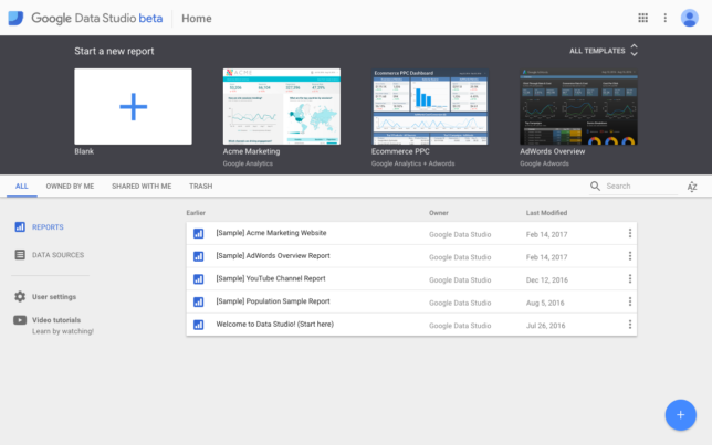
First, log into Google Data Studio using your Google credentials at https://datastudio.google.com/.
Google Data studio comes with premade templates to make it easy to make reports, but we’ll touch on that later. We’ll be starting from scratch with a new report. Click the blank document under “Start a new report.”
In your new report, we have to connect your data to make the report.
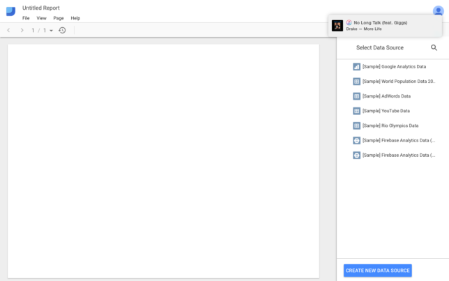
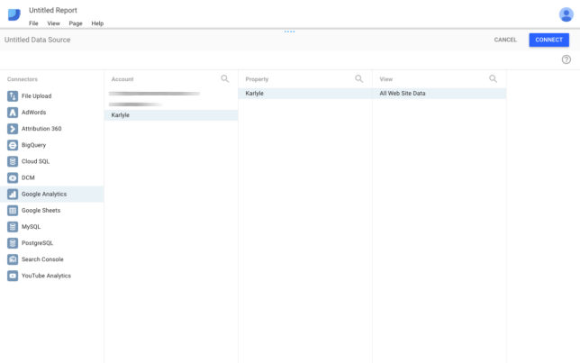
Select “CREATE NEW DATA SOURCE”
There are a variety of sources where data could be pulled from. I’ll be using Google Analytics for this example.
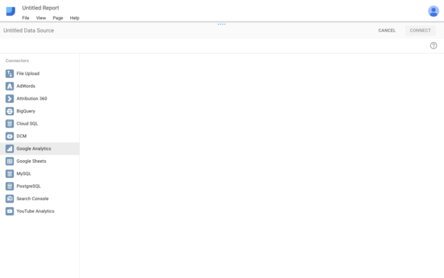
I’m going to funnel down into the specific view in Analytics that I’d like to display. Let’s use this website as an example.
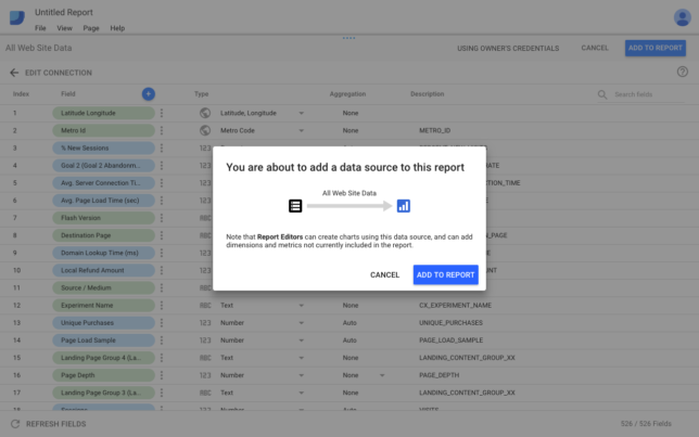
Adding a data source to a report requires you to grant permissions to do so. After you click “CONNECT,” click “ADD TO REPORT,” twice.
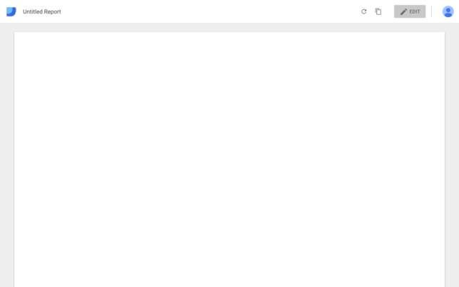
Awesome, you’re now able to start visualizing the imported data.
Visualizing Data in Google Data Studio
At this point, you should see a blank canvas. Click “EDIT” in the top right corner to start adding data.
Here is a simple header.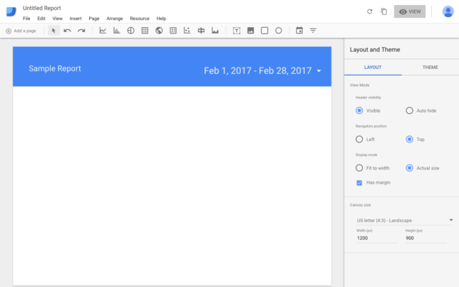
Google Data Studio makes it really easy to maneuver around the platform. The drag and drop functionality allows anyone to customize their report quickly and easily. Here’s how I made this simple report banner above.
To make the rectangle, click Insert > Rectangle > draw a rectangle > move and scale
To title the report, click Insert > Text > draw a text box > type title > move and scale
To add the date range, click the date range icon ![]() and select the date range of the data in the right column
and select the date range of the data in the right column
This is a good start. Lets add more data.
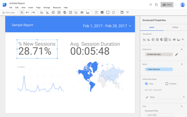
Here are 4 quick metrics that I drew from the data.
To get the percent of new sessions and average session duration, I selected the scorecard option![]() and drew a box on the canvas. These scorecards display a single key performance indicator such as summarizing the total sales in a period or counting ad impressions.
and drew a box on the canvas. These scorecards display a single key performance indicator such as summarizing the total sales in a period or counting ad impressions.
T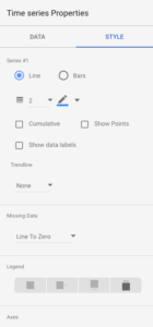 o create the sessions line graph, I selected the time series icon
![]() and drew a box. Still selected, if I wanted to make this line graph a bar graph, I can easily do that by going to the column on the right, go to the “STYLE” tab and select bar. This section allows you to customize the graph to your liking.
and drew a box. Still selected, if I wanted to make this line graph a bar graph, I can easily do that by going to the column on the right, go to the “STYLE” tab and select bar. This section allows you to customize the graph to your liking.
To display the map, I selected the Geo Map icon ![]() and drew a square. This map shows the amount of sessions by location and you can get very specific. For example, with the map selected, instead of showing the entire world, I can drill down into a specific city, state or country.
and drew a square. This map shows the amount of sessions by location and you can get very specific. For example, with the map selected, instead of showing the entire world, I can drill down into a specific city, state or country.
Lets say that these data points are exactly what you want to show the client. (Hopefully not, though.)
Select “View” in the top right to get out of editing mode. You’ll now see how the report will look to the client or teammates.
This is a quick preview of how to use Google Data Studio, but to be honest, this report can be greatly improved. Luckily, there are premade templates that we can use to make the data presentation ready. Lets go back to the home page of Google Data Studio.
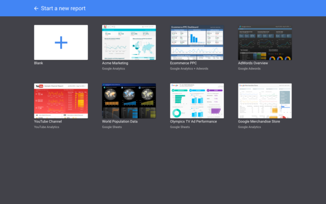
If I select ACME Marketing, a premade Google Analytics template, it already has users, sessions, pageviews bounce rate, top countries etc. neatly displayed in a document.
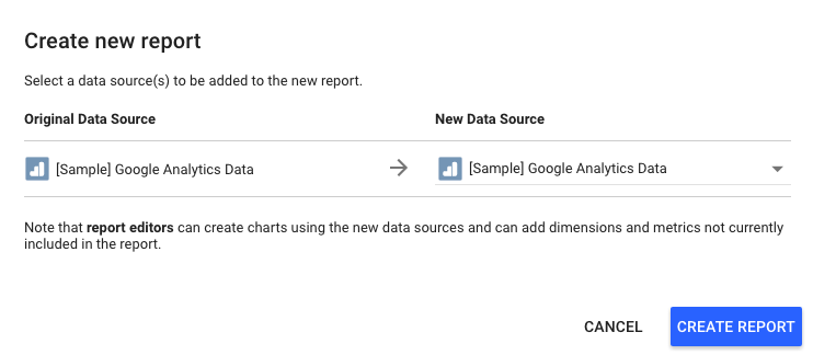
All I’d have to do is select “USE TEMPLATE” > “CREATE REPORT” and then update the data source from the example data to your own Analytics data.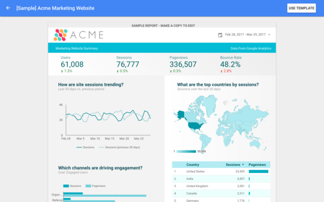
 It’s that simple.
Of course, you can always add metrics or remove metrics that are not related to your report. There are hundreds of templates available online. If you see a template you like, simply make a copy and connect your data.
Groovy.